I’ve recently redone my website..
Nobody cares Dan.
No, I’m sure. I’m just wanting to talk about the process I went through as I changed direction a bit and really had a lot of fun…and learnt a it too.
Design
To begin, I really wanted to bring some character to the site, plus recently, I’d got back into designing and more importantly using Photoshop to lay stuff out. I know right, I’m the one who says Photoshop is worthless and so on.
But here I was spending a wee while mocking stuff up and I have to be honest, I loved it. I probably spent too much time doing it in Photoshop as iteration followed iteration until I was happy with what I had. I spent most of the time ignoring mobile design but I’d gone down a certain path where I was comfortable with the mobile side just falling into place in the build process.
What you see now was not how it started. It was quite flat and boxey, it probably still is. The funny thing is (it’s not that funny), all the extra bits like balloons and birds came after the build was pretty much done. It’s stuff like that which adds character. Today I was reading an article from Creative Blog about sites losing their soul. I’ve tried to inject a bit of my personality here as I think a lot of stuff is like web design by numbers.
Looking back at how the design developed, the more I appreciate how much I enjoyed the process. I still think designing in the browser is my preferred choice as my site improved as I was building it rather than in the Photoshop phase however I think I got a better building block from Photoshop rather than in the browser.
How does that work in a working environment with a dev and designer. Who wins the battle there? Well that depends on the project, the people and so on. I learnt a lot about my skillset and my design limitations whilst doing this so it’s all good.
One thing that did help was finding out that you can now sync fonts from Typekit to Creative Cloud so I was able to design with the fonts from the beginning which is fantastic. Say what you want about Adobe but this is a great improvement. On a side note regarding Typekit, it still surprises me how many people don’t use the advanced javascript on offer from Typekit. You can read about it here.
Development
Development wise, this was my first website built using Gulp. I’ve spoken in the past about me and automation and how I hated it. Gulp has given me confidence in automation again. I get it now, mainly because it works for me. I’m by no means an expert either. There are tons of resources online for it so you should really check it out. Or Grunt…but Gulp works for me.
I also had the task of getting Gulp working on both Windows and Mac. The Mac was easy to get going, Windows not so but that’s Windows I think. This is my gulp file as is.
Disclaimer here. This is my working file, It works for me at this present moment and for what I am doing. It could be improved I have no doubt. I just haven’t investigated it enough so use this hashtag if you want to slag me off on Twitter #dancantusegulp.
With Gulp, I am minifying my Sass and jQuery. I’m building a WordPress theme so have stayed away from doing anything with my PHP. I don’t even know if I can. But that’s other day’s work. With my Sass, I have several files for typography, components, header, footer, navigation and a base one. I have also a layout file but looking to lose that and combine with others. These obviously get combined into a base.min.css which is great. On this project, I’ve really pushed my knowledge of CSS transitions and animations and whilst I know it’s not Premier League standard, I’m really happy with the outcome.
Same with my js files although I tend to work with just one js file. I’ve seen some combine ALL their js together including plugins and jQuery. I don’t know if this is good or bad so I’m going to say bad. Please correct me if I’m wrong.
[edit] Having spoken to Shane about this, I can see the point of it now. [edit]
One thing I was keen to do with the new site was make it as quick as possible and google friendly so I followed the rules from Google Page Insights. I’ve touched on it a bit in another post but I thought I would add a bit more detail as I was told my previous post “wasn’t detailed enough”.
Minify everything!
We’re told to minify our JS, CSS and HTML. The first two I had sorted, the latter not so but I managed to pass the test by simply removing white space at the start and end of each line and removing breaks so it’s not 100% minified in the true sense but enough. I would say though, going back to this markup after you have done this is a pain in the arse so I need to get Gulp working with WordPress or I keep a copy as backup each time.
Optimise your images
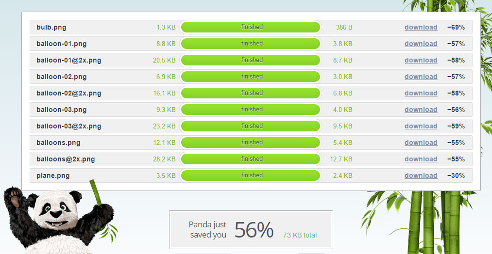
I’ve seen images in the past be massive, like proper massive yet sit in a space 200px wide. That’s not proper friendly so I use https://tinypng.com/ to compress my png and jpgs. It’s surprising how much you save by doing it. Infact while I write this, I know I have to do some more on them.

Prioritise visible content
I originally was going to have a large header image (it’s never been done before) but I chose to go with text as I felt it lacked personality. At least with some copy, I could set the tone. Doing this might have helped with visible content, I don’t know for certain. Maybe I should test it. Does it really matter?
Eliminate render-blocking JavaScript and CSS in above-the-fold content
I should just direct you to this blog post fast and furious websites as I’ve covered it already. No matter what I did, I was always told that I has render blocking script. I looked at inlining it but thought what a faff and it didnt really seem to work when I tried it but a few kind words from Alex and a bit of investigation, I came across The Critical Path CSS Generator which is a god send. Basically, tell it your domain, paste in your CSS and it spits out a load of CSS that is critical to the page loading above the fold (I think that’s right). Once you have done that, you can then load in your CSS file asynchronously (Yeah, I pulled that face too). It’s actually pretty easy.
LoadCSS is a bit of javascript that allows you to do just that. Tell it where you CSS lives and hey presto. Below is the code I am using (production code is minified).
function loadCSS(e, n, o, t) {
    "use strict";
    var d = window.document.createElement("link"),
        i = n || window.document.getElementsByTagName("script")[0],
        l = window.document.styleSheets;
    return d.rel = "stylesheet", d.href = e, d.media = "only x", t && (d.onload = t), i.parentNode.insertBefore(d, i),
d.onloadcssdefined = function(n) {
        for (var o, t = 0; t < l.length; t++) l[t].href && l[t].href.indexOf(e) > -1 && (o = !0);
        o ? n() : setTimeout(function() {
            d.onloadcssdefined(n)
        })
    }, d.onloadcssdefined(function() {
        d.media = o || "all"
    }), d
}
loadCSS("?cache=2s");
Top Tip
Just a heads up. If you have moved CSS inline that contains image paths, you might need to amend so they load otherwise you lower your page score.
By now I could take on the world!
Sadly, my quest for 100% was thwarted by a few things. I’ve since found out from 1&1 direct that GZip whilst is working is not setup to work with CSS and JS files on the type of account I have so no matter what I do with the htaccess file, it simply won’t work but here is mine anyway, it might be of use to someone. If you don’t know is GZip is working, you can test it here.
# BEGIN WordPress ## EXPIRES CACHING ##ExpiresActive On ExpiresByType image/jpg "access 1 year" ExpiresByType image/jpeg "access 1 year" ExpiresByType image/gif "access 1 year" ExpiresByType image/png "access 1 year" ExpiresByType text/css "access 1 month" ExpiresByType application/pdf "access 1 month" ExpiresByType text/x-javascript "access 1 month" ExpiresByType application/x-shockwave-flash "access 1 month" ExpiresByType image/x-icon "access 1 year" ExpiresDefault "access plus 1 year" ## EXPIRES CACHING ## AddType x-mapp-php6 .html .htm .php # BEGIN WordPressRewriteEngine On RewriteBase / RewriteRule ^index.php$ - [L] RewriteCond %{REQUEST_FILENAME} !-f RewriteCond %{REQUEST_FILENAME} !-d RewriteRule . /index.php [L] # Keep connection aliveHeader set Connection keep-alive # END WordPress
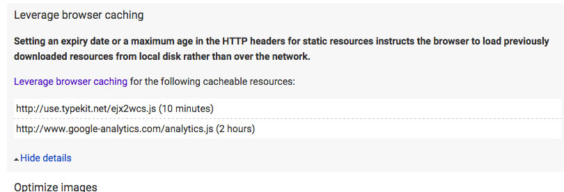
Along with Gzip, I was struggling with Typekit and Analytics as they were coming up as issues under Leverage browser caching. I’m not really sure what the answer is here. Again, if you have ideas, let us know.

So here I am with an score of 95 – 97 out of 100 which I’m pretty chuffed with considering it’s a WordPress website. I am thinking of moving hosts soon so maybe that will go up. Google says it’s a slow host too which is not great advertising for 1&1 eh.
I was by now happy with the website. It looked alright and worked alright. But I found myself adding little bits like the balloons and plane and I kept forgetting to update my critical path CSS in the header.
Don’t forget the minified JS!
Yes, I almost forgot. I was using an external JS file for all my jQuery goodness which apparently was an issue too so I decided to minify it and whack it all in my footer inline. I’d seen it done before so I though what the heck. Is it quicker? I guess it is but not massively noticeable.But like the CSS in my header, I kept forgetting to update it if I made a change so I need to rethink how Gulp generate stuff. Maybe there is a way to tell it to send outputted content to a designated placeholder. Not sure.
The end of my longest blog post…I think
So that’s it I think. I’ve covered pretty much all I went through to rebuild and how I plan to build sites in future albeit with hopefully a better way of inlining. I’m happy to answer any questions or criticism (remember that hashtag!). Redoing your own site is bloody hard work. I’m the toughest client in the world and I change my mind daily on what I like. Even now I am looking at the current site and questioning a few things but hey, that’s how we learn new stuff isn’t it?
In conclusion, I have learnt that over time things change. We follow a path that says to do things one way and then it changes and we someone appear right back at the start. We were told never to inline CSS and now here we are doing that. Is that the future? Does it even matter what Google say? I still find the way of inlining a bit clunky to say the least plus I see bits of my site un-rendered at times which makes me sad and also maybe incompetent in other eyes. I’ve followed the tutorials and listened to the advice but I can’t help thinking Google will change something and we’ll all end up redoing what we did.
I guess we’ll wait and see. I’ve disabled comments for now but I’d love to talk about this with others. Conversations are what makes the world go around.
Some light reading
Why Web Design Is Losing It’s Soul
Shane Prendergast and the quest for 100/100