
Working in eCommerce for the past 5 years, I have seen a lot of sites where the shopping experience sits front and centre stage and often the pages that are deemed less crucial tend to go live ignored or unloved. You know the sort of pages. About us, delivery information even pages like blogs and buyers guides. Typically, CMS pages where text is added via a WYSIWYG editor. Of course, this is by design.
A CMS allows someone to add pages quickly and often at a price with the pages usually existing of long paragraphs of text and full width images. Ask any designer working with these kinds of pages and hear the stories of how they wanted something to look good but restrictions put in place by the platforms left the pages looking like a copy and paste job.
Even with the advance of CSS and HTML, we are still facing restrictions that keep pages in the stone age. It also comes down to skill set. Once a site is handed over to the client, more often than not, the eCommerce / Marketing team that inherits the site won’t have the necessary skills to produce the designed content easily which often explains why pages end up looking like they do.
Over time though and solutions have improved. We have solutions like page builders like you have in Magento 2.4 or SaaS solutions like Shogun and Styla which really do push the content editors to produce more engaging content. But this comes at a cost so it’s not always the right solution.
Boring content
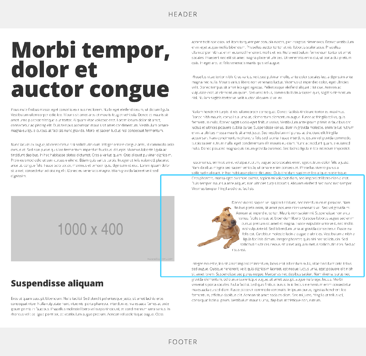
First off, what do I classify as boring content? I'm not really talking about the words but more about pages that are literally just lines and lines of text and images that fill the page as you can see from the example. The text is really hard to read because the user gets bored reading it. This is down to line length which I wrote about last year. We could do a couple of things here to the content to make it more readable and pleasing on the eye.
Restrict the width of the content using a max width via CSS. This ensures that the content never goes past a certain width in the browser.
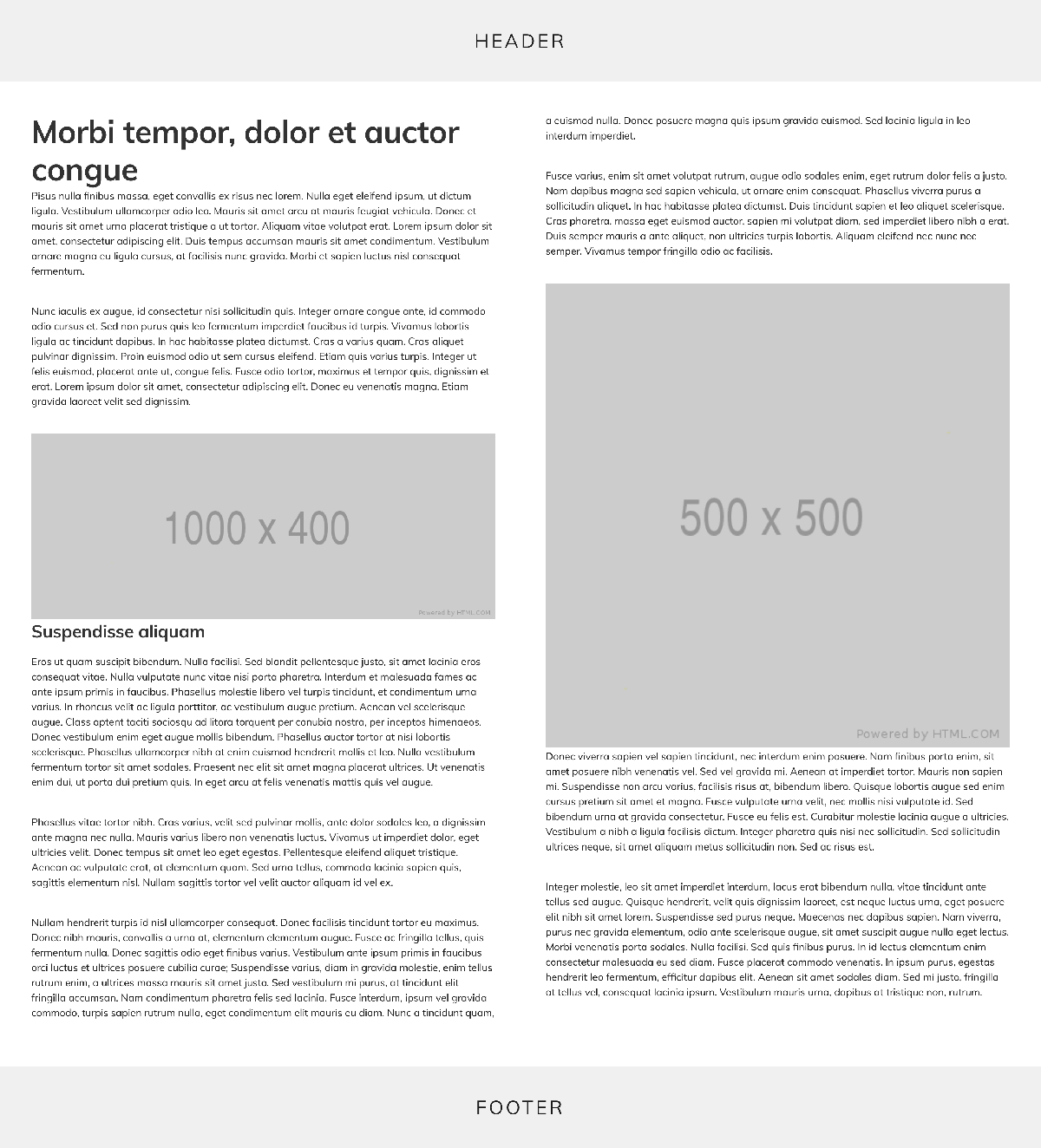
Use CSS columns to split the copy and images by adding a class to the content container. To achieve the columns of content, I have created a CSS class called ‘with2Columns’ and added it to the main container where the content sits.
Typography
A site’s typography is very important. It’s easy to just rely on whatever is setup on a site but there is a lot we can do with CSS and HTML to really make pages standout plus any page can standout. As standard, your site will likely have CSS rules for all Header tags (h1 - h6) but we can also create extra classes to add to these elements which extend the range of styling achievable.
letter spacing
Using the CSS property line-spacing, we can improve text legibility by increasing or decreasing the letter spacing. Increasing / decreasing too much can though make it pretty illegible. One rule I work with is that I never increase the letter spacing on non capitalised titles as it doesn't look right most of the time.
Header with negative line spacing
Header with positive line spacing
text shadow
Shadows are often done badly on the web. They can make a clean looking site look dated and cheap in a matter of seconds but if you use them in the right way, they can help legibility and improve the design. And not all shadows needs to be grey, we can use other colours to get as good an effect.
Header with drop shadow
Header with drop shadow
colour gradients
Gradients are in fashion right now and we can achieve some nice gradient effects with CSS. This is one of those things that needs proper thought but it is very achievable and can lift a page.
Header with a colour gradient
vertical text
Not all text needs to be horizontal although using this technique needs some thought and planning but when used right can look really good.
Vertical
header
Sed ut perspiciatis unde omnis iste natus error sit voluptatem accusantium doloremque laudantium, totam rem aperiam, eaque ipsa quae ab illo inventore veritatis et quasi architecto beatae vitae dicta sunt explicabo. Nemo enim ipsam voluptatem quia voluptas sit aspernatur aut odit aut fugit, sed quia consequuntur magni dolores eos qui ratione voluptatem sequi nesciunt. Neque porro quisquam est
Qui dolorem ipsum quia dolor sit amet, consectetur, adipisci velit, sed quia non numquam eius modi tempora incidunt ut labore et dolore magnam aliquam quaerat voluptatem. Ut enim ad minima veniam, quis nostrum.
Images
A lot of the pages I see, the images seem to have just been plonked on the page with no real thought as to it's size and position often filling the page at a resolution they were not meant for. We can however control them with CSS and use the space well to create great looking content.
float
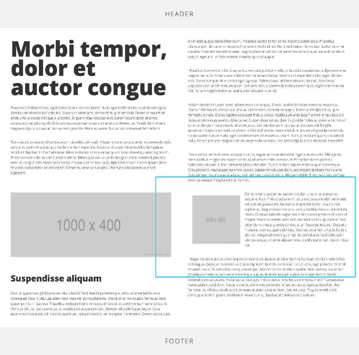
We can use a technique called floating to force the text to wrap around the image. A lot depends on the size of the image and the dimensions but we can add a class to the image to make it sit left or right of the text giving it a more editorial look.
shape outside
We can also do some clever things with shapes. In the example, the text is flowing around the image. We are using a polygon shape to force the text around the image giving us the results you often see in print design.
To summarise then
All of the above are things we can do to a page to improve how it looks but also how it reads. Like any good website, a lot of thought needs to go into the content and what you are trying to achieve but we don't need to be kept prisoner by our CMS. But on the flip side, just because you can doesn't mean you should. Always consider the options and try to keep it simple.
But that's not the end of it!
Taking it to the next level with layout
A lot of what I have talked about is simple tweaks to existing content to make it "pop" as my old CEO used to say. One of the advances of CSS has been how we can layout web pages and content. Back in the day, we had to build sites with floats to achieve complex layouts and the introduction of responsive added a new level of complexity to the mix. Thankfully today, we have new ways of laying out pages with minimal effort. Say hello to Flexbox and Grid.
Grids
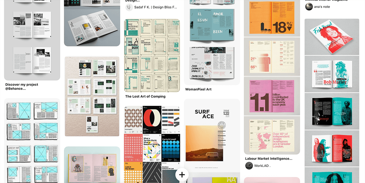
Grids in design have been around for over 1000 years so what I am talking about is nothing new for design or the web. It's just that to achieve grids has always been hacky in how we build pages. There was always this conception that print designers shouldn't design webpages as they didn't grasp the fact grids were broken in the web and often, designs were often too rigid to adapt to content or simply couldn't be done. Now, we are armed with the tools to produce the layouts we have wanted to do from the very start and it's actually really easy.
I'm a huge fan of magazine and book designs and love how pages can be laid out. Now we are able to combine the print world with the digital world when it comes to layout in very little code. I use Pinterest a lot and in the image below, you can see some of the design possibilities we could achieve with our content.
Just stop for a minute
What I don't want to do is fill your head with fanciful ideas that you can dive straight into this and it will all be plain sailing. That would be reckless.
First off, we need to consider the content. Does it need it? We also need to consider the platform and CMS you are using. Do you support older browsers, is your site responsive? Are you even skilled to do it or can you enlist help from either someone in the team or at an agency level.
Content Management Systems are restrictive
Nothing beats working with CSS and HTML but not everyone can write it so that is why we have CMS. We can do a lot with them but they are not always as modern as you like, can be a little bit quirky and often stripped back to the bare minimum. But it is done for a reason.
Today we have things called Page Builders which give a user a lot more control over how their page looks which is a massive step forward. Having worked with a handful now, I can see they are going in the right direction so hopefully in the next few years, content design will be second nature.
Until then, we are forced to work with what we have. My advice is to speak to your developers / designers or agency support about the options. You might be able to implement CSS helper classes that you can add to the WYSIWYG editor or maybe have templates built to give you an arsenal of layouts. There are always options.
Final thoughts
I hope this has given you some ideas and food for thought around the content on your site. Like I have said throughout, it's not a case of just whacking a shadow on a title and using big fonts, it's really about considering the message you are trying to get across and if you can improve the legibility but also maybe inspire people to buy into your brand or buy your products. I'm a huge fan of storytelling and we can back up that now with content that stands out and doesn't look half done.
There is so much to talk about around content I know and it's not all about the design side but hopefully we can eliminate those pages that you think, meh, could have done a better job with that.
Useful Links
Here are a few helpful links.