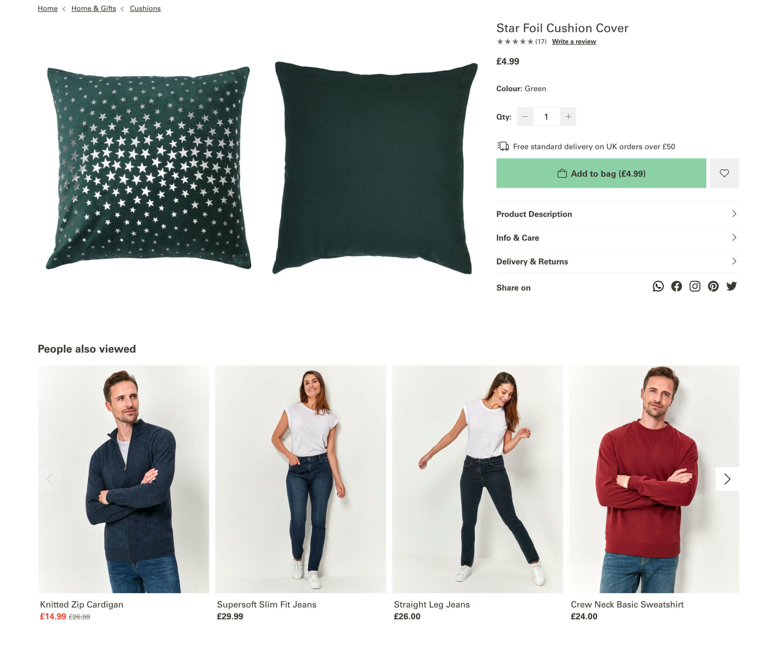
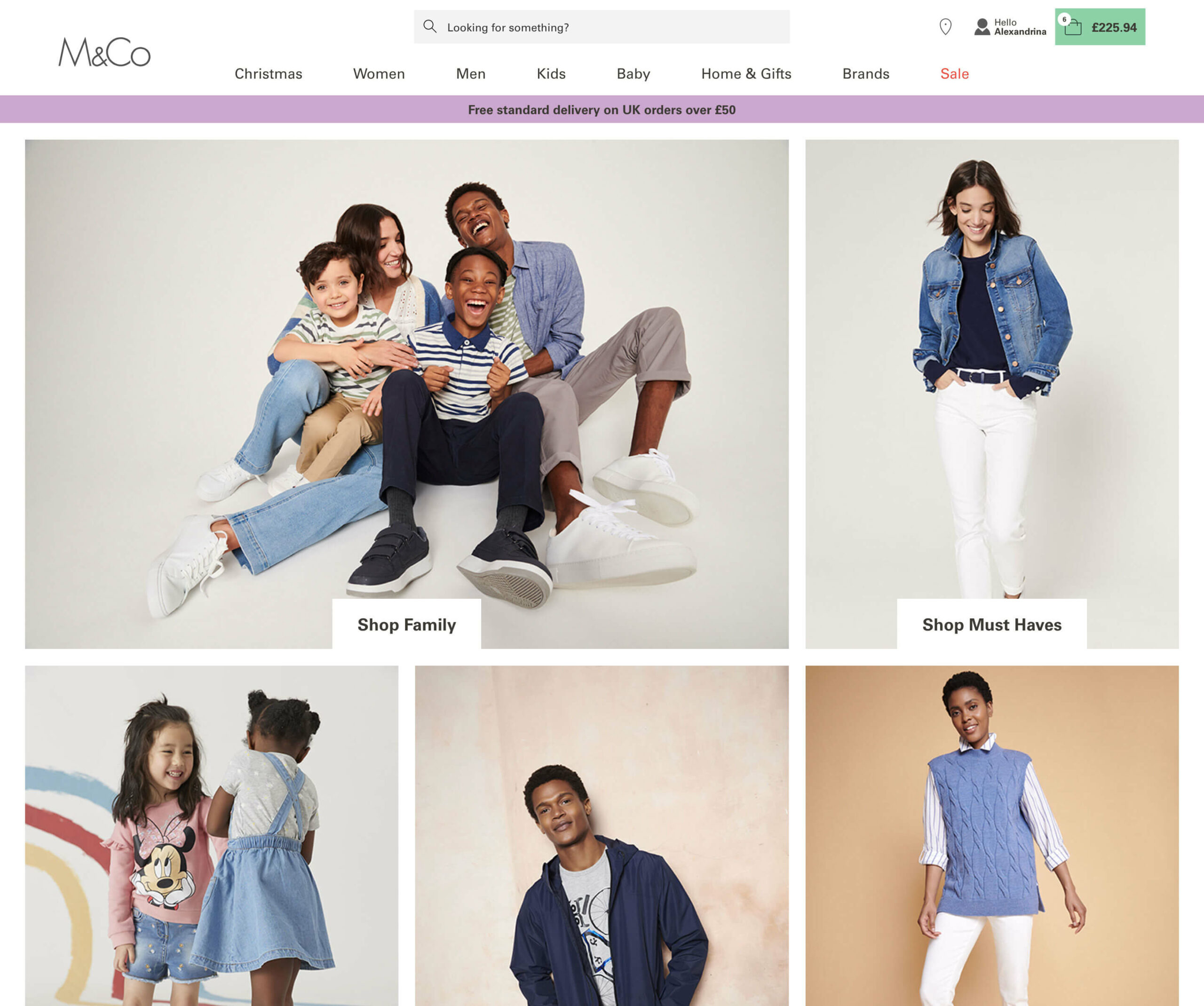
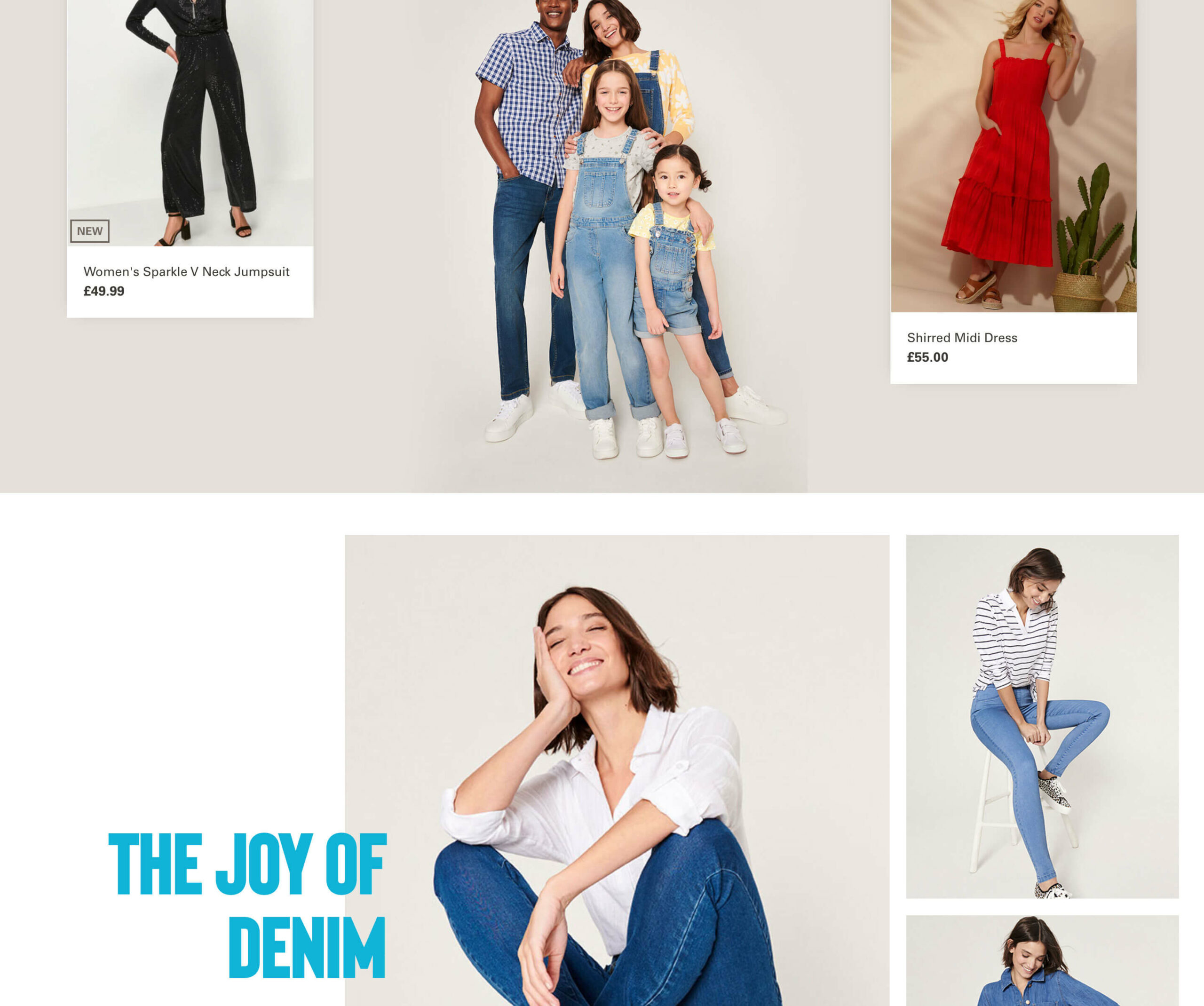
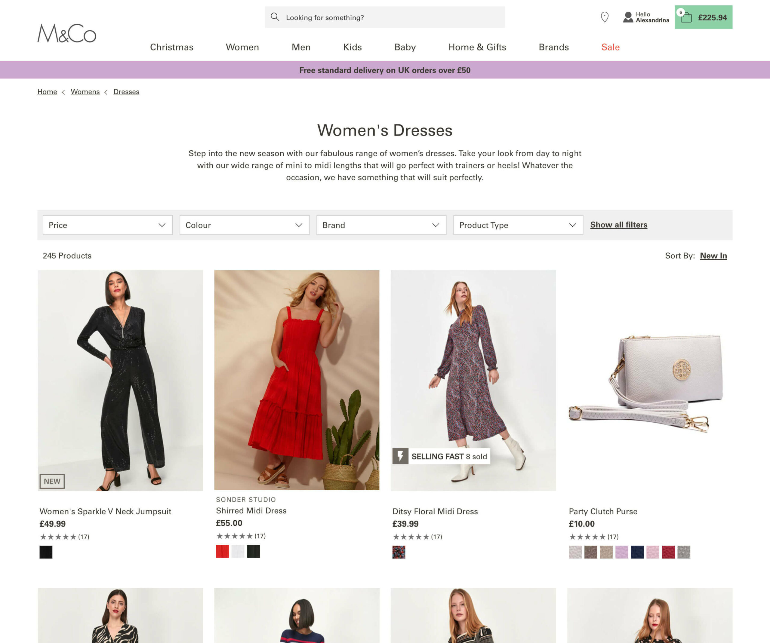
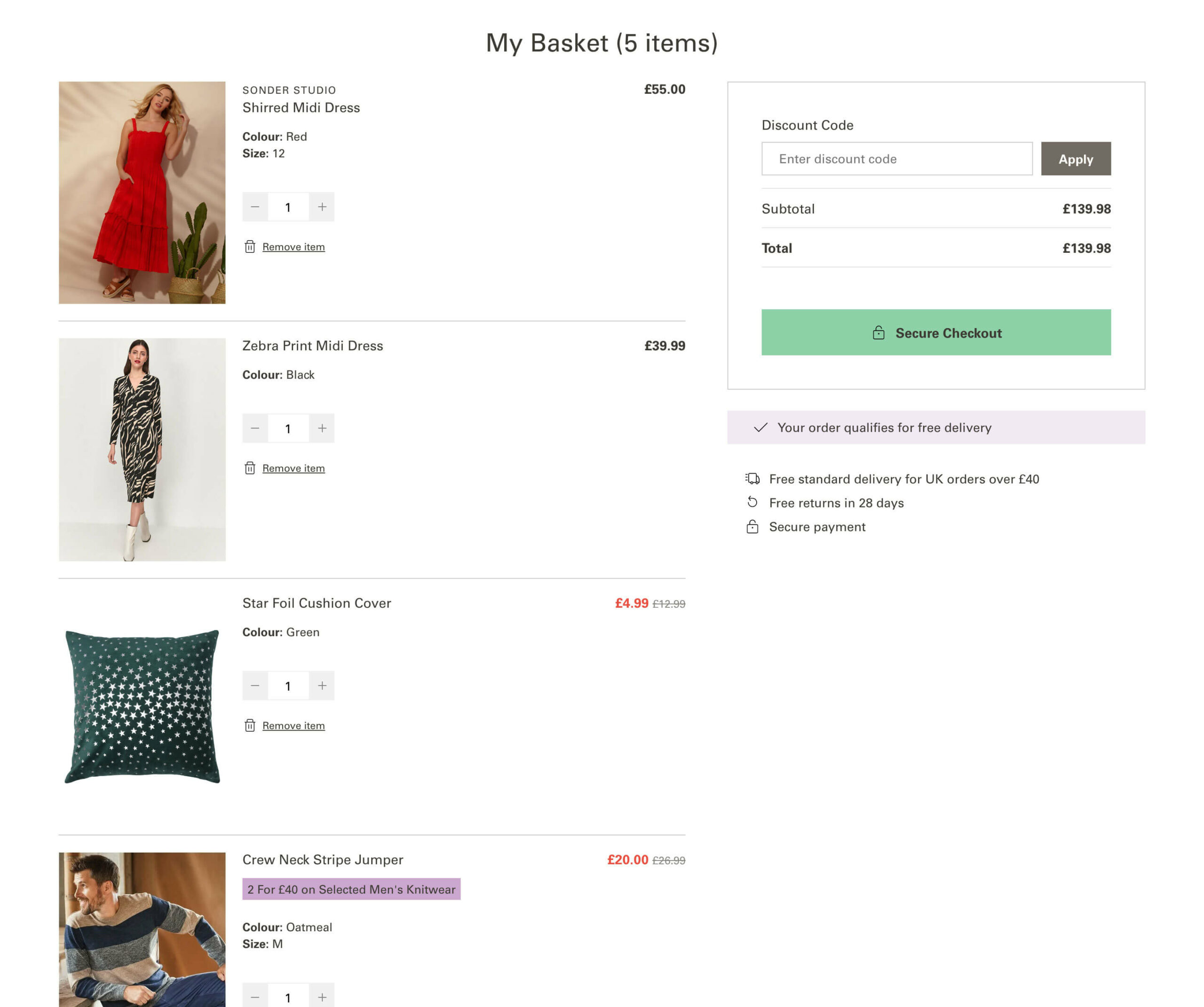
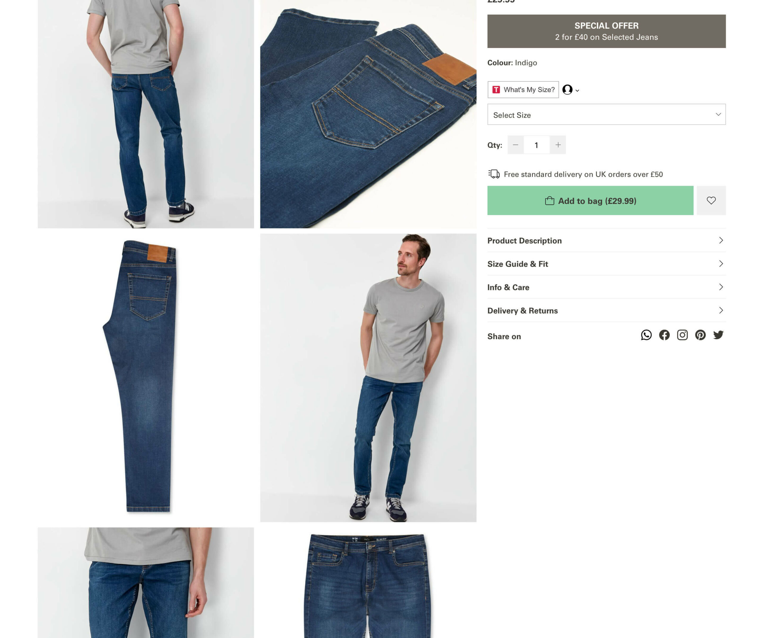
I was tasked with redesigning the MandCo online store this year with Space48. It was going on to the Big Commerce platform. The brief was to modernise the site using their new branding and improve the UX and UI where I could.
The designs were created using CSS, HTML and jQuery for interactions.
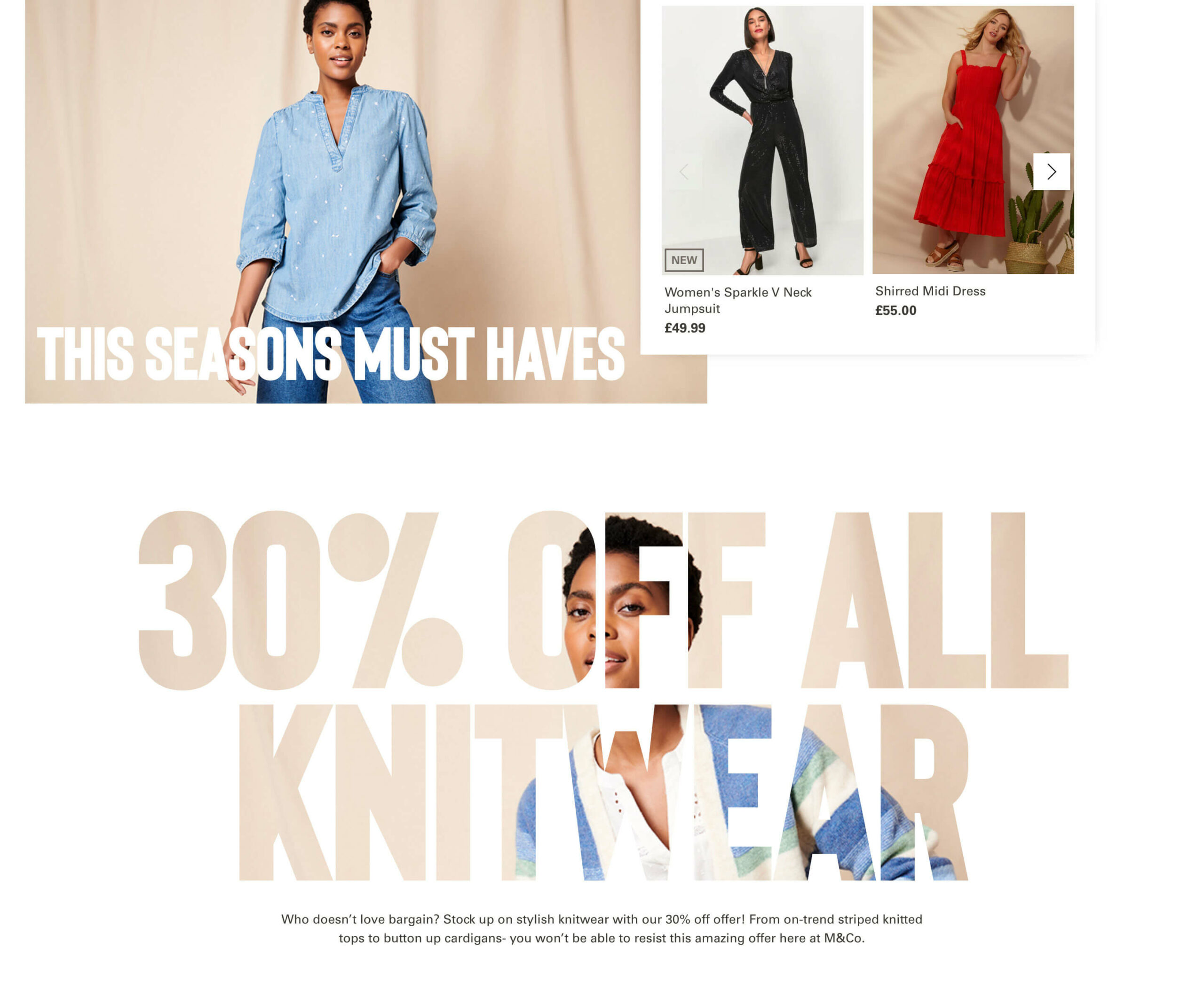
Something I wanted to do was really design unique blocks for content on the home and landing pages using Shogun, a third party CMS Pagebuilder.
Pain points for me in the project was third parties and getting exactly what I wanted to show on the screen especially around messaging.
Workflow
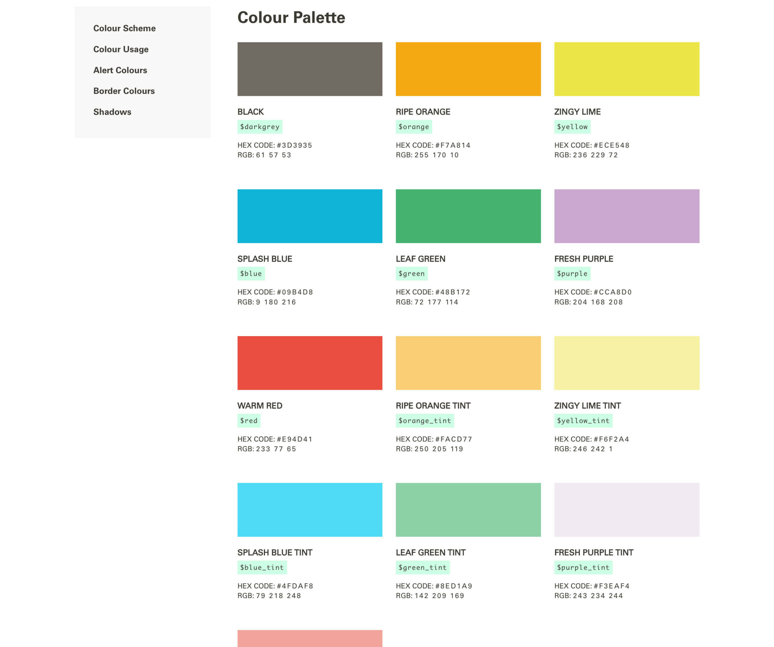
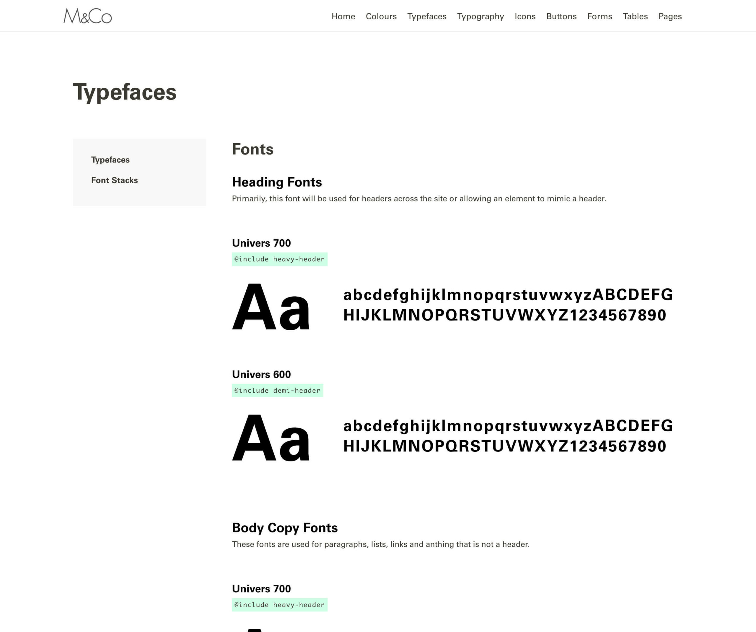
After the story mapping session was carried out, we set to task with the team to understand more about the brand, what sort of site they were looking for, who their competitors are, what they were doing. At the same time, the client was having a brand refresh which allowed us to feed into the online branding and help make creative decisions around colours and fonts as the vast majority of the guidelines were offline only.
Once we had agreed functionality likes and dislikes and an online style, we set about creating designs with various options. Once we had sign off on the designs, they moved to development where we continued to feedback on the build and how well the build matched the designs.

